This Work is Too (2021)
This Work is Too is a self-negotiated project brief that I wanted to do because it celebrated my love for Camp. Camp and Kitsch have a reputation for being aesthetics/sensibilities that are hard
to ‘get’ or ‘understand’ because a lot of it is based on feeling, and causes some confusion. They also have a reputation for being of ‘bad taste’ by many art elitists, and I wanted my project to combat that perception through a double approach of education and celebration. The title of it plays on the idea that Camp is often perceived to be ‘too much’ , like a snobby art elitist commenting on the work, and the project’s tone is supposed to be reminiscent of Camp: fun, colourful, cheeky and absolutely irreverant.

This project is a virtual exhibition/museum of all things Camp and Kitsch hosted on Instagram, with themed weeks featuring particular artists/personalities associated with this style, and hopes to bring more appreciation of it as a style and awareness of its deep history and context
amongst art appreciators
amongst art appreciators
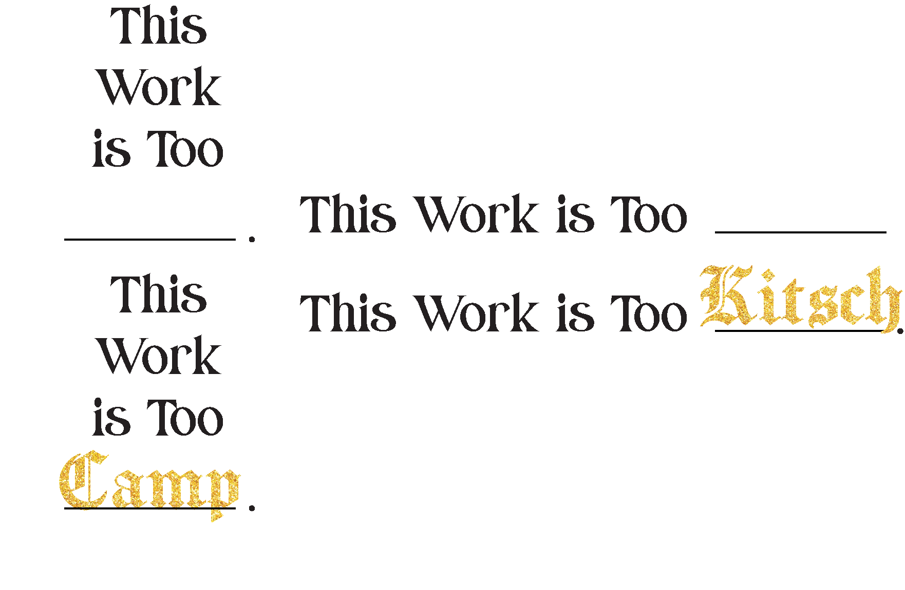


Type treatment and logo variation for the project. It is shortened to the acronym T.W.I.T for marketability purposes, and it is also an example of the project’s tongue in cheek humour as twit is British slang for a stupid person, befitting its Camp nature. It is also a subtle reference to Rupaul’s Drag Race’s coined phrase and accompanying cheeky acronym: ‘Charisma, Uniqueness, Nerve and Talent’ (C.U.N.T).

Illustrated visuals featuring an intepretation of a Camp or Kitsch artist’s works which are posted at the start of every ‘featured artists’ week, usually set to a very tongue-in-cheek humour to play on the Camp aspect. This one features Jeff Koons, an artist whose works often have kitschy tones to them and who is most known for his balloon dog sculptures, which the visual plays on.

This variant features Lisa Frank, an artist turned corporation (Lisa Frank Inc.) with a very distinctive whimsical and rainbow style that features on many products such as stationary sets and school supplies. The style has many elements of kitsch in it, and its distinctiveness is part of the reason why it was chosen. The visual plays on the concept of its sugary saccharine style, mixed with the loose association of the over the top style has with the visuals one experiences when consuming drugs. (A question that’s been asked of Lisa Frank herself)